
We also completed our work on eyes, cheeks and lips. Here are some photos of the awesome models that came to sit in my practice chair.
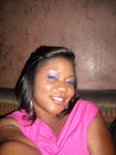
 This is my linesister Anike. I only did eyes on her...I was practicing blending. Oh and her eyebrows. Them joints was incorrect when she sat in my chair. But look how lovely they are now. I had to pluck, trim and wrangle those eyebrows.
 You will know I'm getting down to the nitty gritty when I put my hair up like this. lol.
Next is Blair: I was supposed to be doing Bridal Makeup on her...I think it looks nice, but I don't know how good I did in the bridal arena. *shrug*

Next were Kali (again...lol) and Candace! I didn't do Candace's makeup, another girl in my class did, but they both looked lovely. Plus I love this picture of Candace.

 Definitely needed the practice on the lightskinned girls. So thanks for coming out!
Now on to business matters. Yesterday we had a whole day on the business of makeup. How to get started as a professional artist, paying taxes, registering names, and getting clientele. Very interesting and informative.
So everytime I do someone's face for an event, they always ALWAYS ask.... Do you have a business card? No friends I don't. I know its weird, being that I'm actually a graphic designer, and spend the majority of my day designing these things for other people's company's.
(btw. my online portfolio can be found here: http://klang.carbonmade.com)
But in reality, I'm sooooo indecisive about my own stuff. I can design something for someone else, decide that I love it, show it to the client, they love it...I can move on. But when I design for me, I love it for 3 days, sometimes, 3 hours and then decide, after staring at it, it ain't that hot.
This is where you come in. Since you all helped me to decide on a moniker (Keke Lang is the winner...shout out to the 2 people who voted for my real name, my mother will appreciate that lol)...I'm hoping you can also form an opinion on my logo and business card. Here are your 3 choices.
Choice 1: This is still a work in progress, and I'll most likely take the pattern off the background on the side that has my info. But the logo is my actual signature. Also the number and email address are hard to see, but that must be this jpg, because its quite bold on my actual computer.
 Choice 2: Is the same thing, only square. I'm leaning towards a perfectly square card. I think they're cute...and different.
 Choice 3: Is completely different. While the first 2 really fit my personality, style, and the LEO in me. For some reason this choice really appealed to the smidge of Virgo in me. Very...clean.
 Anyway, your feedback would be greatly appreciated. I know you guys will definitely come forward with you opinions. So I guess that means we need a new poll!
I like choice 1 the most. I think you should make the side with your info completely black and then have the print on the back. The square card is a cute idea but it will be hard for people to keep your card in their business card holder thingys since it's a different format. Thanks for the shouts. Again. :)
ReplyDeleteI like the first business card. :)
ReplyDeleteI have to agree with Kali on the sizing of the square card ...cute but not all that practical. Love the fact that the first one looks like it is scribbled in lipstick. Why not change the background and make it all black? The print detracts from your information.
ReplyDeleteI really like Choice 3 as well. I think it is perfect for your upscale clients.
omg! You so did not have to WRANGLE. It was more like gentle coaxing heiffer! Anyways, I thoroughly enjoyed your class and seeing you, talented and lovely as always.
ReplyDeleteChoice one is awesome, but I would have to see the print in perseon to determine. Choice 3 looks like a brand, which is also a good thing, so when you come out with your personal line, you can use that...
I love it. I think Brides want more drama..I know I did. I did my own makeup actually for my big day..and Ive done other folks too...but you did GREAT. Need to get u some more yellow gals! LOL! and I like card #1
ReplyDeletei definitely like choice one the best. its an attention getter without being over the top. you are almost done sister! yay you!
ReplyDeletebreak a leg tomorrow!
ReplyDeleteannnnd... I didnt know you knew Chaquis Maliq.. small world.
xoxo
p.s. Still want you to do makeup for the saartjie project
Jessica